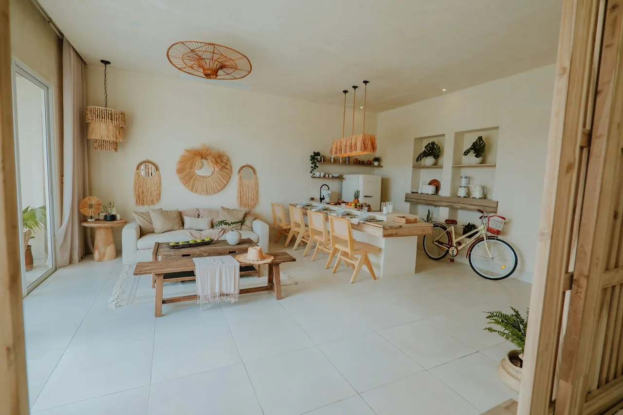
The room visualizer is a style-to-material navigator: pick the surface you're planning — flooring, countertops, or cabinets — and the style direction you're drawn to — warm wood, cool and gray, natural stone, or modern matte — and it points you straight to the materials that deliver that look, plus a path to order samples. It is honest about what it is. It does not render a photorealistic picture of your kitchen, because a screen rendering would flatter a material and mislead you on color, texture, and scale. Instead it translates a mood into the real materials that create it, so you browse the right products and — critically — see them as physical samples in your own light before you commit. Choose a surface and style to get matched materials, then request samples with a free consultation.
Enter values and calculate.
A style starting point. For a true room mockup, send photos with your free consultation.
How to Use the Room Visualizer
The tool takes a surface and a style and hands you a curated path to the right materials. Getting a look you'll still love after installation depends on how you use that path — six steps make it work.
Pick the Surface You're Planning
Choose whether you're styling flooring, countertops, or cabinets. Each surface plays a different role in a room — the floor sets the base, counters and cabinets carry the eye level — so the tool tailors its material path to the surface you name.
Choose the Style Direction You're Drawn To
Select warm wood, cool/gray, natural stone, or modern matte — the overall mood you want the room to read. This is a direction, not a final color; it steers you to the family of materials that produce that feeling so you're browsing the right shelf, not the whole store.
Follow the Link to Matching Materials
Press Show ideas and the tool links you to the materials that deliver your style in your surface. Follow it — those pages carry the specs, finishes, and use-cases that tell you whether a beautiful look also performs in your room.
Check the Look Against the Room's Demands
A style has to survive the space. A warm-wood floor in a wet room needs a waterproof material that reads like wood, not solid hardwood. Confirm the look you picked comes in a material your room's moisture and traffic allow.
Coordinate the Surface With Its Neighbors
A surface never lives alone. Run the tool again for the adjoining surfaces — floor, counter, cabinet — so your warm-wood floor, stone counter, and cabinet color form a palette, not three separate decisions that clash at install.
Order Physical Samples Before You Commit
No screen shows a material truthfully. The decisive step is holding samples in your own room's light, morning and night, against your fixed elements. Request them, and a written recommendation, at the free consultation.
Used this way, the visualizer does the job a mood board can't — it connects the feeling you want to the specific, orderable materials that create it, and then sends you to the only preview that tells the truth: the sample.
How the Style Matching Works — the Logic and Why It Points to Samples
The tool isn't rendering your room and it isn't guessing. It maps a named style direction to the material families documented to produce that look in a given surface, then routes you to samples because that is the only honest final preview. Here is the logic.
Step One: The Surface Sets the Material Vocabulary
Each surface achieves a style through a different set of materials, so the surface you pick determines the vocabulary the tool works from. A warm-wood look is hardwood or wood-look LVP in flooring, butcher block in countertops, and a stained solid-wood or Shaker door in cabinets. Same mood, three different material answers — which is why the tool asks the surface first.
Why a Screen Rendering Would Mislead You
The tool deliberately does not paint a picture of your room because a monitor cannot show a material honestly. Screen color shifts by display calibration and ambient light; a rendering flattens the texture and depth that make stone read as stone; and scale on screen bears no relation to how a pattern reads across a real floor. A flattering render is a false promise. Routing you to a real sample is the honest alternative.
What a Physical Sample Reveals That a Screen Can't
A sample in your own light shows the true undertone against your wall color, the actual sheen under your fixtures, the grain and movement across a real piece, and how the color shifts from the cool north light of morning to warm evening lamps. Those are exactly the variables that decide whether you love a surface for a decade — and none of them survive a screen.
The Role of Lighting in Every Style Choice
Lighting is the hidden variable in any style decision. A cool-gray floor that looks crisp in a showroom's fluorescent light can turn blue or drab under warm home bulbs; a warm-wood tone can read orange in strong afternoon sun. That's why the final step is always samples viewed in situ, at different times of day — the tool gets you to the right candidates, your room's light picks the winner.
Step Two: The Style Direction Selects the Material Family
With the surface fixed, your style direction narrows the vocabulary to a family. Each direction corresponds to documented material characteristics — species and stain for warm wood, cool-toned stone and gray-wash finishes for cool/gray, veined natural stone for the stone direction, and low-sheen surfaces for modern matte — so the match is grounded in what actually produces the look, not in a label.
The Full Style-to-Material Map Across Surfaces
The tool shows one path at a time; the map below lays out how each style direction is achieved in each surface, so you can plan a whole room and see where a look is possible before you pick.
| Style direction | In flooring | In countertops | In cabinets |
|---|---|---|---|
| Warm wood | Oak, hickory, wood-look rigid-core luxury vinyl | Butcher block | Stained solid wood, Shaker |
| Cool / gray | Gray-wash wood, gray porcelain | Gray quartz, soapstone | Gray-painted cabinets, flat-panel |
| Natural stone | Slate, travertine, stone-look tile | Granite, marble, quartzite | Paired with stone-look surfaces |
| Modern matte | Matte-finish tile, low-sheen LVP | Matte quartz, honed granite | Matte flat-panel, thermofoil |
The map makes the tool's value plain: a single mood resolves into different materials by surface, and seeing all three columns at once is how you build a palette instead of three clashing choices.
The Inputs That Shape Your Style Match
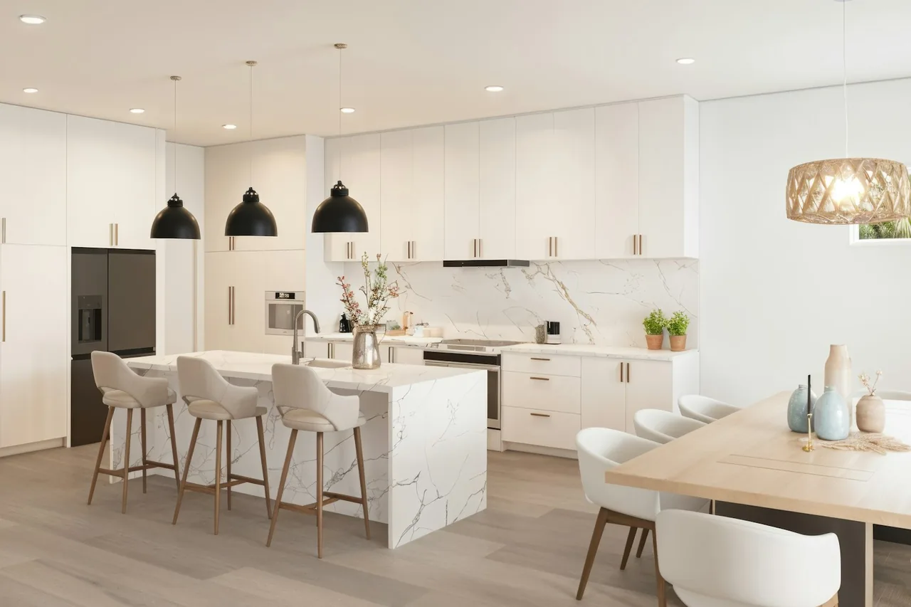
Two dropdowns drive the tool, but several real factors determine whether a matched look actually works in your room. Knowing them is how you read the match critically.
| Input / factor | How it shapes the match | Where it's confirmed |
|---|---|---|
| Surface | Sets the material vocabulary for the look | Your project scope |
| Style direction | Narrows the vocabulary to a material family | Your design intent |
| Room lighting | Shifts how every tone and sheen actually reads | Samples viewed in situ, day and night |
| Room moisture | May require a look delivered in a waterproof material | Moisture test during prep |
| Fixed elements | Existing counters, trim, or wall color the look must sit with | On-site palette review |
| Adjoining surfaces | The floor, counter, and cabinet must read as one palette | Coordinated sample layout |
The tool takes the first two; the rest are why samples and an on-site review exist — they turn a promising look into one that holds up in your actual room.
How to Interpret Your Style Match
The tool hands you a look and a material path; reading it well means knowing what it assumed and what should send you to check a sample first. Use this to translate the result into a next move.
| What you got | What it means | What to do next |
|---|---|---|
| A warm-wood flooring path | Hardwood or wood-look LVP delivers the look | In a wet room, choose the LVP route; sample both |
| A natural-stone countertop path | Granite, marble, or quartzite creates the veining | Sample the actual slab — stone varies piece to piece |
| A cool/gray cabinet path | Gray paint or flat-panel achieves the tone | Sample against your wall color and lighting |
| A modern-matte match | Low-sheen finishes carry the look | Confirm matte upkeep suits your traffic and cleaning |
| A look you love on screen | The direction is right; the color is unverified | Order samples and view them in your own light |
Every row lands in the same place: the match gets the direction right, and a physical sample settles the color, sheen, and scale that a screen never could.
Common Mistakes When Visualizing a Room
The tool points you well; these are the errors that still lead to a look you regret after it's installed.
| Mistake | What it causes | The fix |
|---|---|---|
| Choosing color off a screen | A material that reads wrong once installed in real light | Order physical samples and view them in situ |
| Ignoring room lighting | A gray that turns blue or a wood that reads orange at home | View samples morning and night, under your bulbs |
| Styling one surface in isolation | A floor, counter, and cabinet that clash at install | Coordinate all three as a single palette |
| Picking a look a wet room can't take | A warm-wood floor in solid hardwood cupping in moisture | Choose the look in a waterproof material for wet rooms |
| Sampling a stone from a photo | Surprise at the real slab's veining and movement | Approve the actual slab, not a representative image |
| Overlooking sheen and upkeep | A matte finish that shows every mark in a busy kitchen | Match sheen to traffic and how you'll clean it |
| Forgetting fixed elements | A new look that fights existing trim, counters, or walls | Sample against everything staying in the room |
Each mistake shares one root: trusting a preview instead of a sample. The tool gets you to the right materials; your own room, with a sample in hand, gets you to the right choice.
Get the Most From This Tool: The Room Palette Framework
Six disciplines turn a style match into a room you'll still love in a decade. Apply the framework and the visualizer becomes the front end of a real design decision.
- 1. Start from a single style direction
- Commit to one mood — warm wood, cool/gray, stone, or matte — and let it govern every surface. A coherent room comes from one direction applied consistently, not four looks negotiated later.
- 2. Match the surface's role to the look
- Let the floor set the base tone and the counters and cabinets accent it. Deciding which surface leads and which supports keeps the palette balanced instead of competing.
- 3. Verify the look performs in the room
- Confirm your chosen style comes in a material your room's moisture and traffic allow — a warm-wood look in waterproof LVP for a wet space, not solid wood.
- 4. Coordinate every adjoining surface
- Run the tool for the floor, the counter, and the cabinets, then lay the matches together. A palette is a set of decisions made in relation to each other, not in sequence.
- 5. Judge only in your own light
- Order samples and view them in the actual room, morning and night, against your fixed elements. Screen and showroom light both lie; your room's light is the only jury that counts.
- 6. Confirm the palette with a consultation
- End with a free consult where samples are laid out together and the recommendation put in writing. The tool points; the sample decides; the consult specifies.
Six Style Questions Worth Answering Before You Buy
Once the visualizer matches your look, these questions turn a promising direction into a decision that survives installation and daily life.
- How does this read in my light, not the screen's?
- Order the sample and check it morning and night — the single most important test, because lighting rewrites every color and sheen.
- Does the look come in a material my room can take?
- A wet room needs the style in a waterproof material; confirm the look survives the moisture and traffic before you fall for it.
- What are the adjoining surfaces doing?
- Style the floor, counter, and cabinet together so the palette reads as one — a look chosen in isolation often clashes at install.
- How does the sheen behave in real use?
- Matte hides some marks and shows others; high-gloss shows everything. Match the finish to your traffic and cleaning habits.
- What do my fixed elements demand?
- Existing trim, wall color, or a counter you're keeping constrain the palette — sample the new look against everything that's staying.
- Does the look fit the budget in the real material?
- Price the matched material at your square footage with the relevant calculator and your quote before the aesthetic outruns the budget.
Answered honestly, these six carry a style match all the way from a screen to a room — because the decisive checks all happen off the screen, in your own space.
Which Look Should You Explore First?
If you want to reason the palette yourself, this chain mirrors the tool's logic — each branch narrows a mood into the materials that deliver it for your surface and room.
- Which surface are you deciding now? Naming the surface — flooring, countertops, or cabinets — sets the material vocabulary, because the same mood is a different product in each.
- What overall mood do you want? Choose warm wood, cool/gray, natural stone, or modern matte. This narrows the surface's materials to a family — warm wood in flooring means hardwood or wood-look LVP, not the whole catalog.
- Can the room take the look in its ideal material? A dry room can carry the look in almost any material; a wet room requires it in a waterproof one, steering a warm-wood floor to LVP over solid wood. Let the room edit the material, not the mood.
- What are the neighboring surfaces doing? Repeat for the adjoining floor, counter, and cabinet so the palette coheres. A stone counter and a warm-wood floor can share a room — planned together, not discovered at install.
- Confirm with samples and a consult. Order the matched materials as samples, view them in your light against your fixed elements, then confirm the palette and price in a free consultation. What survives is your look.
Walked this way, the tree returns the same result the visualizer would — a coherent, room-appropriate palette grounded in real, orderable materials you can hold in your hand before you buy.
Get a spec-matched recommendation
Tell us your surface, room, and goals — free, independent guidance and a vetted installer, nationwide.
Room Visualization Glossary
These terms sit behind every style match — each defined as it functions when you're translating a look into real materials.
- Surface
- The element you're styling — flooring, countertops, or cabinets — each of which delivers a given look through a different set of materials.
- Style direction
- The overall mood — warm wood, cool/gray, natural stone, or modern matte — that narrows a surface's materials to the family producing that feeling.
- Palette
- The coordinated set of surfaces in a room — floor, counter, cabinet, wall — chosen in relation to each other so they read as one design.
- Undertone
- The subtle color beneath a material's surface — a gray that leans blue or green, a wood that leans red or yellow — revealed only in real light.
- Sheen
- How much light a finish reflects, from matte to high-gloss — a style and a practical choice, since sheen governs how marks and cleaning show.
- Texture
- The tactile and visual depth of a surface — grain, honing, veining — largely flattened on a screen and best judged from a physical sample.
- Matte finish
- A low-sheen surface that reads soft and modern; it hides some marks and shows others, so it's matched to traffic and cleaning habits.
- Honed
- A stone or surface finished smooth but not polished, giving a matte, natural look — the common route to a modern-matte direction in stone.
- Wood-look
- A non-wood material — LVP or tile — printed and textured to read as wood, delivering a warm-wood look where real wood can't perform.
- Veining
- The natural mineral pattern running through stone, unique to each slab — the reason a stone look must be approved from the actual piece, not a photo.
- In situ
- Viewing a sample in its intended place and light rather than a showroom or screen — the only honest final preview of a material.
- Fixed elements
- The parts of a room that aren't changing — existing trim, wall color, a kept counter — that any new surface has to sit with harmoniously.
A Real Room-Visualization Decision
One representative scenario shows how the tool turns a vague mood into a coherent, orderable palette — the match set the direction, the samples settled it.
Related Tools, Guides, and Material Resources
The visualizer points you to a look; these resources spec it, cost it, and confirm it for your room.
To compare two matched materials head to head, use the material comparison tool; to let the room pick a surface for you, the surface selector; and to turn a material into a budget, the flooring cost calculator, countertop cost calculator, or cabinet cost calculator with your own quote. To explore the materials behind each look, open hardwood, wood-look LVP, and tile from the flooring hub, quartz, granite, and marble from the countertops hub, or Shaker, flat-panel, and painted from the cabinets hub. For direction on which look wears well, read the surface trends guide and how to choose flooring, browse every estimator at the tools hub, and see the full range of categories at the home surfaces hub.